It is the four-letter word no one likes, but almost everyone uses: debt.
The U.S. federal government is certainly no stranger to it. The national debt clock breached $40 trillion last week. That works out to roughly $360,794 per U.S. taxpayer and is more than double where it stood just ten years ago.
Some of that increase can be traced to the Global Financial Crisis and COVID-19 pandemic, which together likely added roughly $8 trillion to $8.5 trillion to the federal debt. The increase came through some combination of recession-driven revenue losses, automatic stabilizers and fiscal-response programs like enhanced unemployment insurance.
Figure 1. U.S. Total Public Debt Outstanding (Bils. of $) vs. U.S. Recessions

Sources: U.S. Treasury, Bloomberg L.P., and Potomac. Note: Shaded regions denote periods of U.S. recession.
But the bigger issue may be what happened after the emergencies passed. The fiscal deficit has tended to settle at progressively deeper levels following each of the last two major shocks. Even after excluding the recession and immediate recovery years, the average annual deficit widened from 2.7% of GDP from 1929 to 2007, to 3.4% from 2013 to 2019, and roughly 6% in 2024 and 2025.
Figure 2. Average Fiscal Deficit as a Percentage of GDP Post-GFC and COVID-19

Sources: U.S. Treasury, Bloomberg L.P., and Potomac.
That leaves the federal government with a basic math problem: receipts are not keeping pace with outlays. While the revenue side of the ledger has improved somewhat from pre-COVID levels, spending has not, rising from 20.9% of GDP in 2019 to 23.1% at the end of 2025.
One of the biggest changes has been interest. Net interest expense is marching back toward all-time highs, while spending on Social Security and health care has also increased. In another ten years, the Congressional Budget Office expects net interest expense to reach 4.6% of GDP.
That would be nearly twice what CBO expects the federal government to spend on defense and roughly equal to all discretionary spending combined, including Veterans Affairs, science and research, homeland security, foreign aid and transportation.
Figure 3. Federal Net Interest Expense as a Percentage of GDP

Sources: U.S. Treasury, Bloomberg L.P., and Potomac.
That backdrop is causing investors to demand more compensation to own longer-term bonds. Inflation uncertainty, increased Treasury and corporate issuance, uncertainty around monetary policy, rising fiscal deficits and even the loss of some of bonds' traditional hedging power can all feed into a higher term premium. For more on rising stock and bond correlations, please see our Co-CIO Dan Russo’s piece, “Got Hard Assets?”
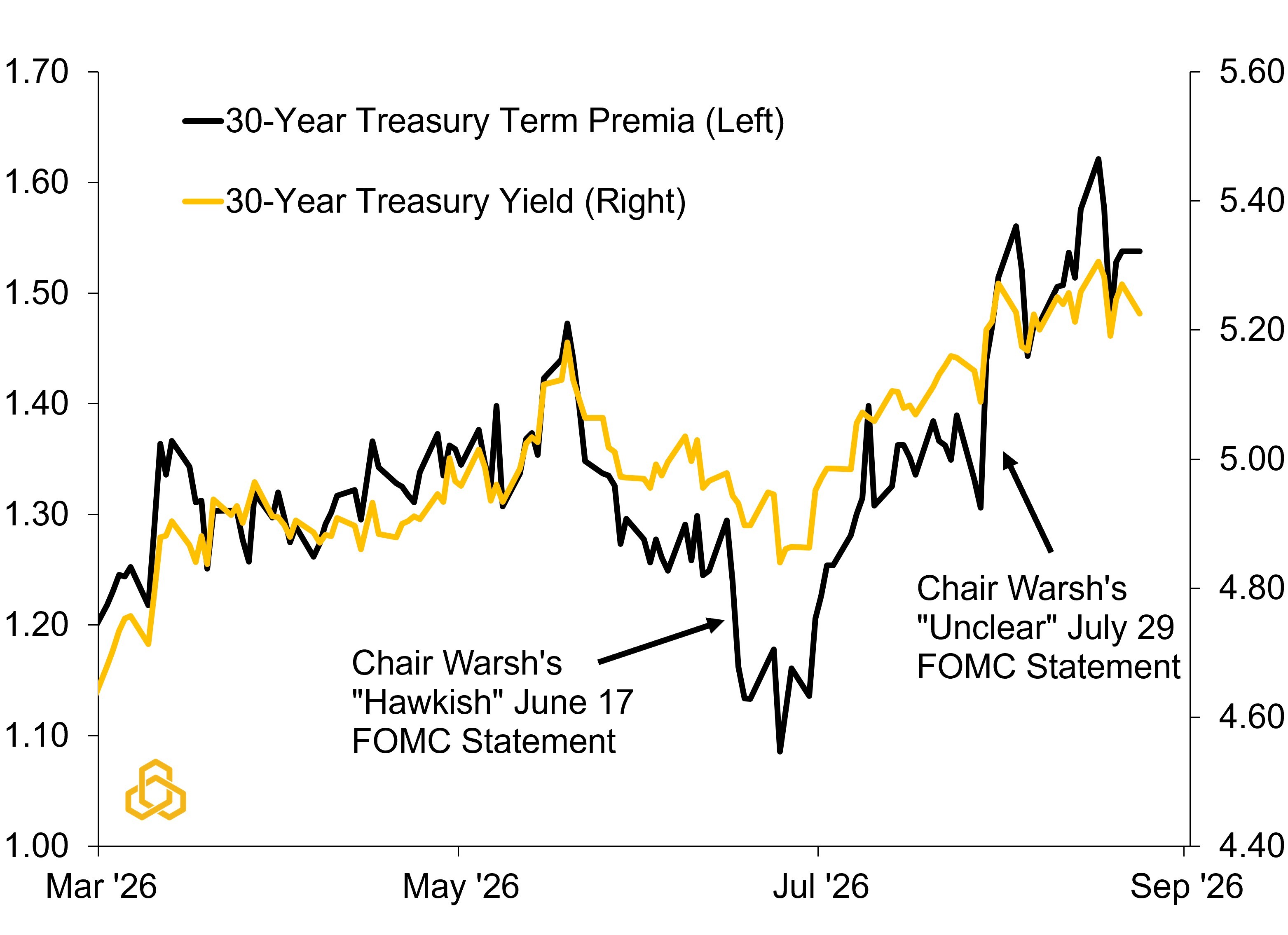
There may also be a new Fed Chair premium creeping into the market. Term premium initially fell after Chair Warsh struck a hawkish tone at his first FOMC press conference, then surged after his second, when investors got little in the way of forward guidance.
The bond market's message was basically: "All bark, but no bite."
Figure 4. 30-Year U.S. Treasury Term Premia and Yield (%)
Sources: U.S. Treasury, Bloomberg L.P., and Potomac.
What does this mean?
The first response has come from the U.S. Treasury. Secretary Bessent announced that the department will double its long-duration Treasury buybacks from $2 billion per operation to at least $4 billion, officially to provide additional liquidity support at the long end of the market.
If Bessent is trying to show bond investors some "bite," this may be the opening move.
Combined with a clearer reaction function from Chair Warsh at Jackson Hole, it could help keep the bond vigilantes at bay over the near term. But neither addresses the underlying problem: large and persistent fiscal deficits.
That is what makes the latest buyback announcement particularly interesting. Sustained Treasury buybacks have historically been associated with budget surpluses and shrinking financing needs. This time around, Treasury is using them as a liquidity and debt-management tool while deficits remain large despite the ongoing economic expansion.
Figure 5. U.S. Fiscal Balance and Unemployment Rate vs. U.S. Recessions

Sources: U.S. Treasury, Bureau of Labor Statistics, National Bureau of Economic Research, Bloomberg L.P., and Potomac. Note: Shaded regions denote periods of U.S. recession.
The chart above helps put the current situation in perspective. Historically, deficits widened when unemployment rose during recessions and then narrowed as the labor market recovered. This time, unemployment remains relatively low while the deficit is still running near levels normally associated with much weaker economic conditions.
The cyclical excuse has faded. The deficit has not.
What does this mean for investors?
Importantly, none of this means stocks cannot keep going higher.
From 1977 through 1997, the 30-year Treasury yield remained above 5%, yet the S&P 500 returned roughly 15.8% annually. During the last major technology investment cycle in the late 1990s and early 2000s, stocks also produced strong gains in several years when the 30-year yield averaged above 5%. Across the years shown in Figure 6, the S&P 500 averaged a 14.4% annual return, even with the declines surrounding the technology bubble in 2000 and 2001. Though volatility during that period was much higher.
Figure 6. “Tech Bubble” S&P 500 Returns when the 30-Year Yield was Above 5%

Sources: U.S. Treasury, Standard & Poor’s, Bloomberg L.P., and Potomac. Past performance is no guarantee of future results. It is not possible to invest directly in an index.
For bond investors, however, the message is less comfortable.
From the start of the 30-year Treasury series in 1977 through 1997, long-term yields remained above 5% and rolling stock/bond correlation was positive most of the time. That remained true even as inflation fell substantially during the early 1990s. In fact, inflation averaged just 2.4% from 1995 to 2000, not far from where it is expected to be in 2027.
The question now is whether that old relationship is starting to come back.
If large deficits, heavy Treasury issuance, and higher term premium keep long rates elevated, bonds may not provide the same cushion they did over much of the past two decades. That does not kill the traditional 60/40 portfolio, but it could make it less reliable precisely when investors want diversification the most.
For passive investors, that may mean more periods when both sides of the portfolio are moving in the wrong direction at the same time. Gold is not a simple answer, with returns historically driven by everything from real rates and monetary policy to central-bank buying and geopolitical risk. But if bonds become a less dependable hedge, investors may need to look beyond the traditional stock-bond mix for diversification, with less-correlated alternatives and hard assets potentially playing a larger role.
Figure 7. Stock / Bond Correlation vs the 30-Year U.S. Treasury Yield

Sources: U.S. Treasury, Standard & Poor’s, Bloomberg L.P., and Potomac. Note: “Stocks” are the S&P 500 and “Bonds” are the Bloomberg U.S. Treasury Total Return Index. Past performance is no guarantee of future results. It is not possible to invest directly in an index.
Weekly “Keeping it Strait” Highlights:
The U.S. – Iran stalemate continues with crude oil prices swinging back and forth and Treasury yields going along for the ride.
Weaker retail sales resulted in a downgrade in the Atlanta Fed’s GDPNow tracker, but growth is still tracking at 4% in the third quarter. That seems way too high in our opinion, but we will see.
It seems like many of these data series have stabilized of late. This could change as activity picks up in the fall and the Fed perhaps provides more clarity on monetary policy, but for now things seem fairly quiet as we finish out the summer.


